HPC Performance Bottleneck Analysis with Explainable Local Models
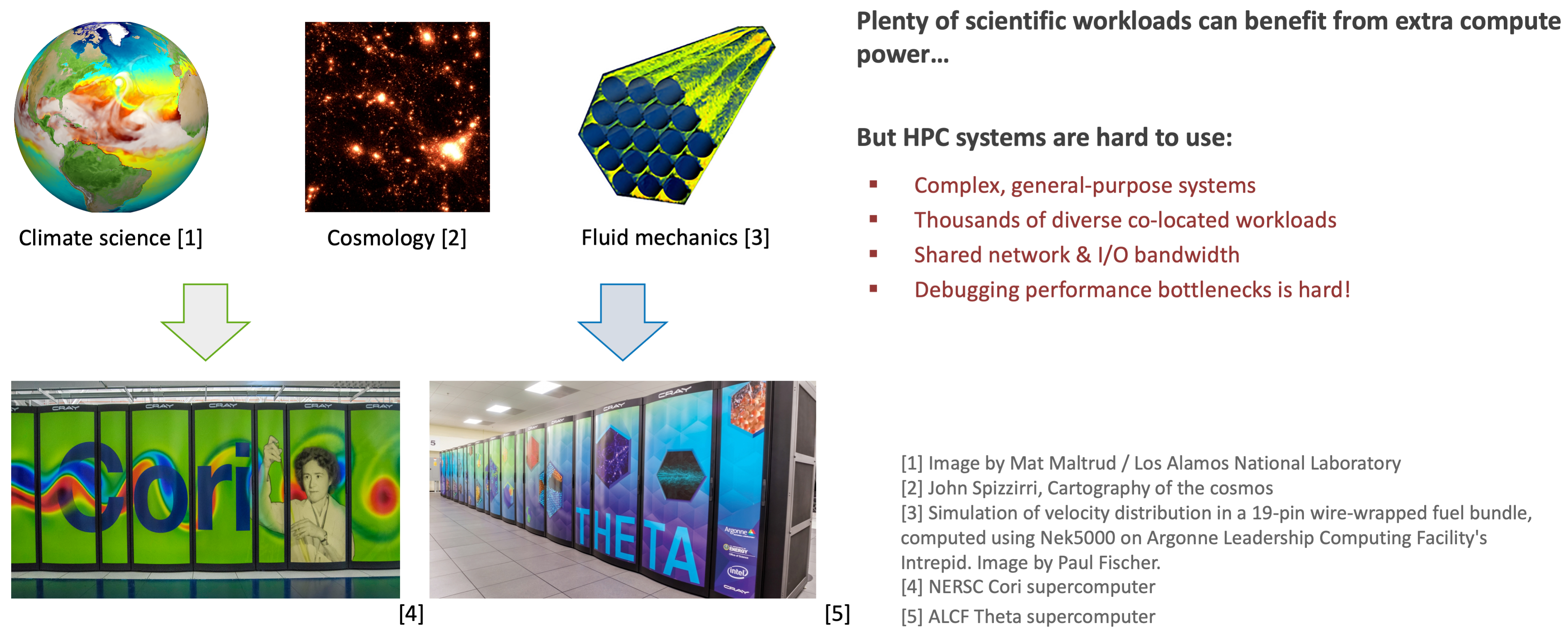
With the growing complexity of high-performance computing (HPC) systems, achieving high performance can be difficult. We analyze multiple years’ worth of Darshan logs from the Argonne Leadership Computing Facility’s Theta supercomputer in order to understand causes of certain performance issues like poor I/O throughput using Gauge.
HPC systems are complex, multi-layered and heterogeneous. Achieving good system performance or utilization takes a lot of experience and tuning.
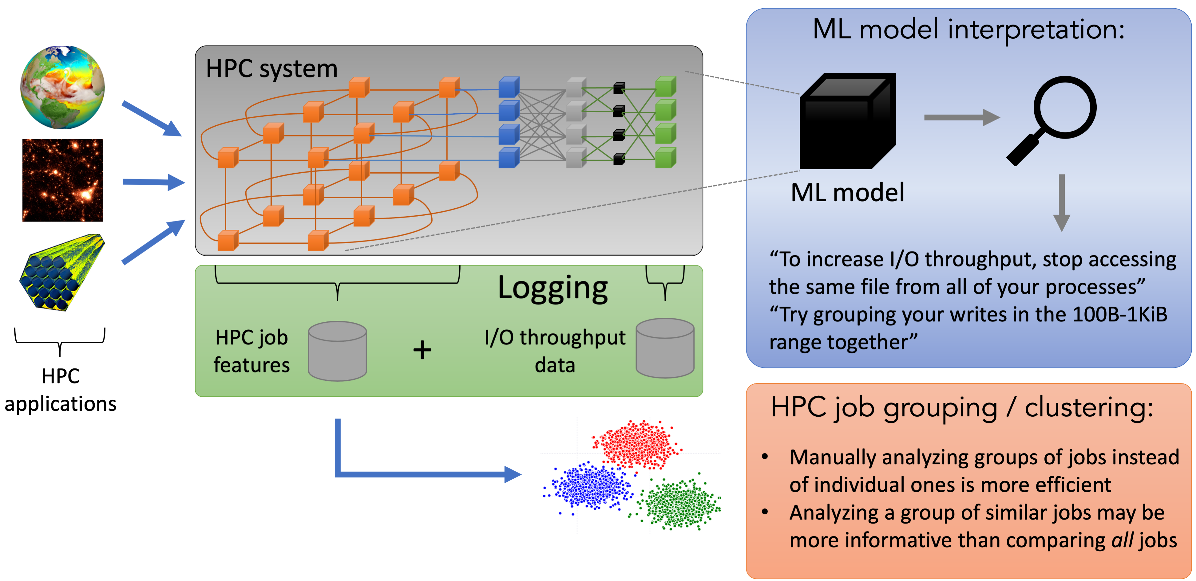
We find groups of jobs that at first sight are highly heterogeneous but share certain behaviors, and analyze these groups instead of individual jobs, allowing us to reduce the workload of domain experts and automate I/O performance analysis. We conduct a case study where a system owner using Gauge was able to arrive at several clusters that do not conform to conventional I/O behaviors, as well as find several potential improvements, both on the application level and the system level.
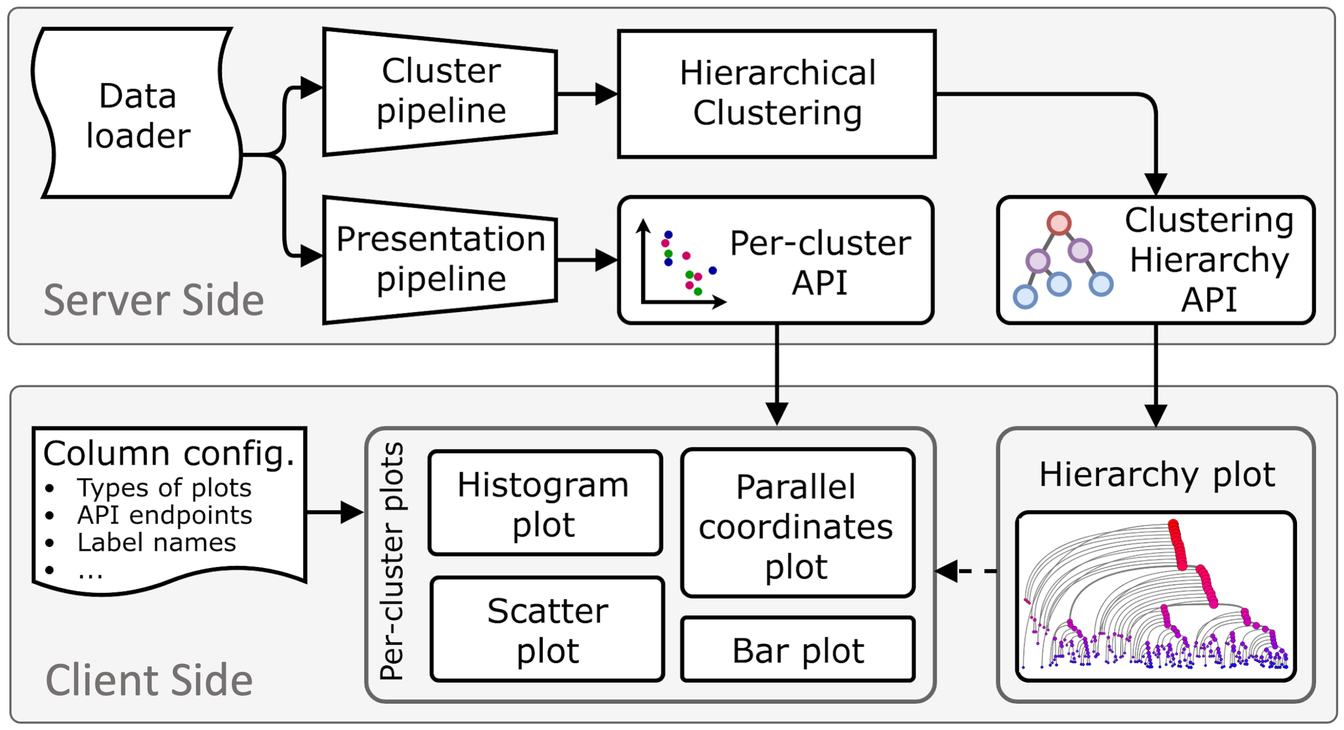
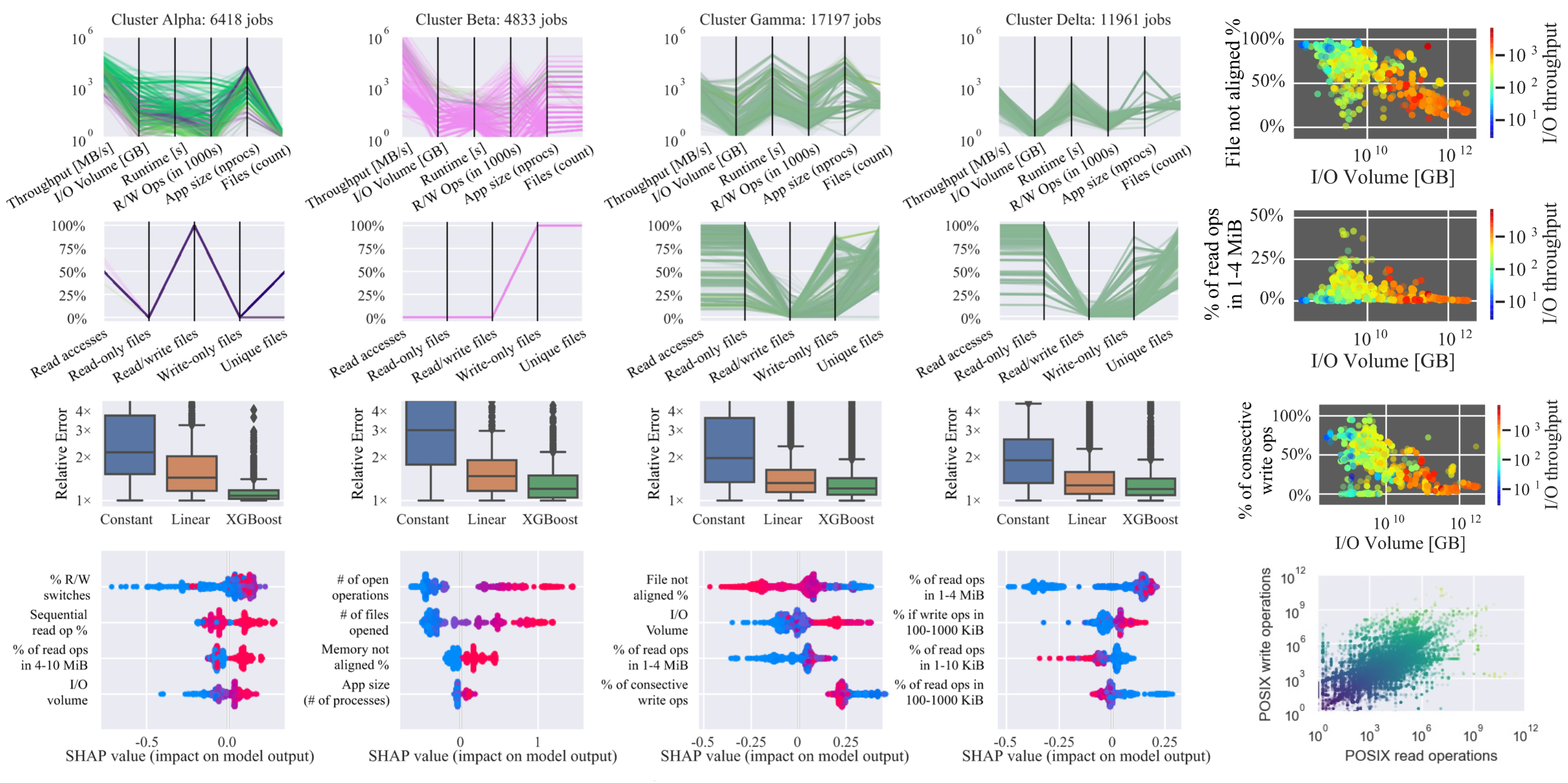
Gauge aids in the process of visualizing and analyzing, in an interactive fashion, large data sets by combining HDBSCAN hierarchy, cluster visualizations, and model interpretations. It lets the user select clusters in the hierarchy where the cluster information is displayed in a column of graphs. Gauge enables the user can see interactively the performance of different machine learning (ML) models. User can evaluate what features impact the ML model using different techniques, e.g., SHAP [1]. SHAP is a game theoretic approach that can explain the output of black box machine learning models.
[1] Scott M. Lundberg, Su-In Lee, A Unified Approach to Interpreting Model Predictions, NIPS 2017.
Interactive Data-Driven and Analysis Visualization
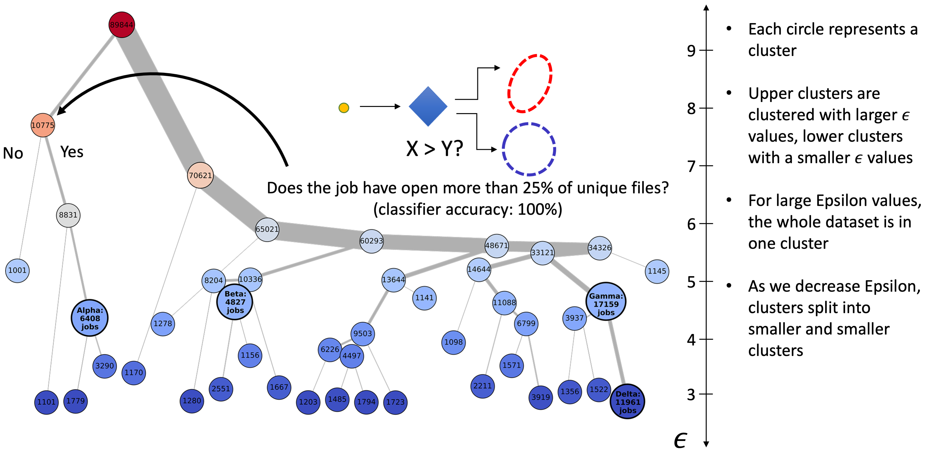
In a nutshell, Gauge takes unorganized data and provides a hierarchical, interactive visualization. Gauge offers several levels of granularity at which to view jobs from high-level clusters arranged in a tree structure to condensed sets of graphs for each user-selected cluster in the tree down to the fine-grained views of each data point and each feature in a cluster.
Through an interactive process, user can build their own features and clustering tree. Hovering over a node displays the cluster parameter and number of items, and for further analysis the user can click the nodes to reveal key details about the cluster. The nodes in the hierarchy can be colored by the size of each cluster, the ε value of each cluster, or by whether a cluster contains jobs from a specified user or app. One of the more useful features is coloring by feature value. Here, by averaging a user-specified feature’s values over all of the jobs in the cluster, we determine the cluster’s color.
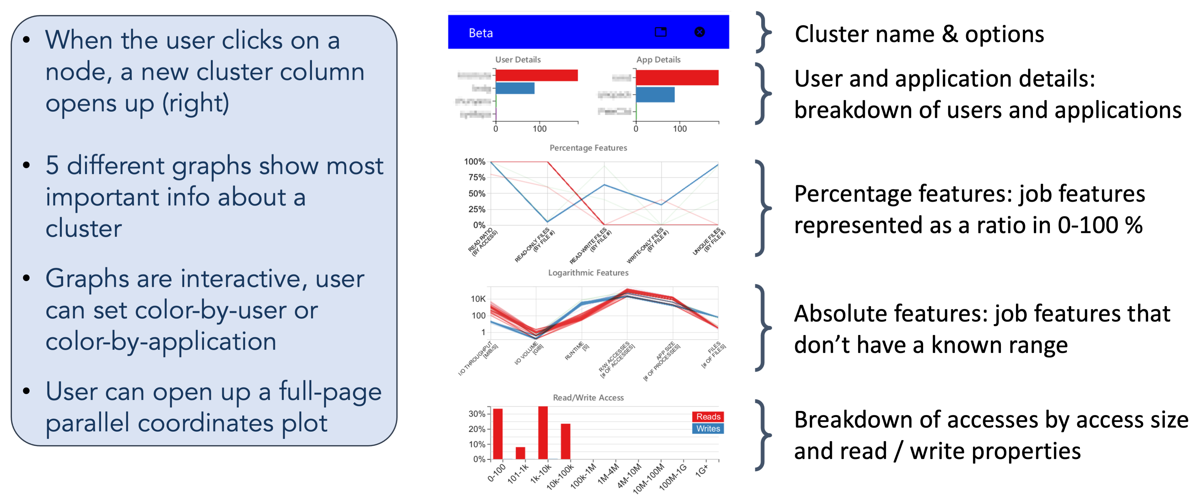
Through an interactive process, user can build their own features and clustering tree. Hovering over a node displays the cluster parameter and number of items, and for further analysis the user can click the nodes to reveal key details about the cluster. The nodes in the hierarchy can be colored by the size of each cluster, the ε value of each cluster, or by whether a cluster contains jobs from a specified user or app. One of the more useful features is coloring by feature value. Here, by averaging a user-specified feature’s values over all of the jobs in the cluster, we determine the cluster’s color.
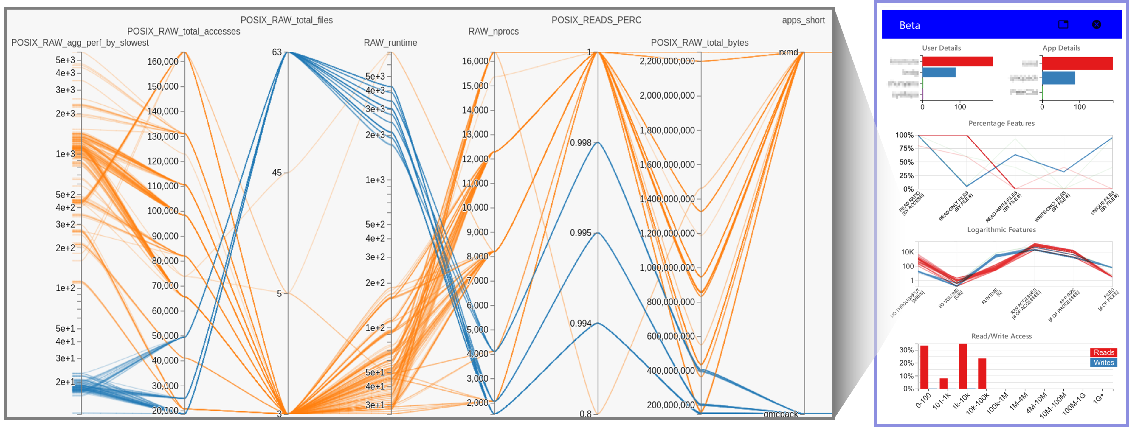
Although Gauge graphs offer information about 31 different features of a cluster, a user may want to analyze a specific combination of features or may want to observe only a subset of the jobs in the cluster. To allow such analyses, Gauge also includes a full-page, highly customizable parallel coordinates plot based on HiPlot [1] that can be called for each cluster individually. With the ability to select any combination of the 53 recorded features in these examples, the HiPlot package allows users to visualize interactions between features that may otherwise go unnoticed in the cluster columns described above. By using HiPlot, Gauge lets the user quickly add or remove selected data points, color data points based on any of the selected features, or even change the type of axis used for each feature. User can choose between using a linear, logarithmic, percentage, or categorical scale. The user’s selections are stored so that any following HiPlot selection modals will automatically apply those decisions.
[1] D. Haziza, J. Rapin, and G. Synnaeve, “Hiplot, interactive highdimensionality plots,” https://github.com/facebookresearch/hiplot, 2020.
Taxonomy of Error Sources in Machine Learning Models
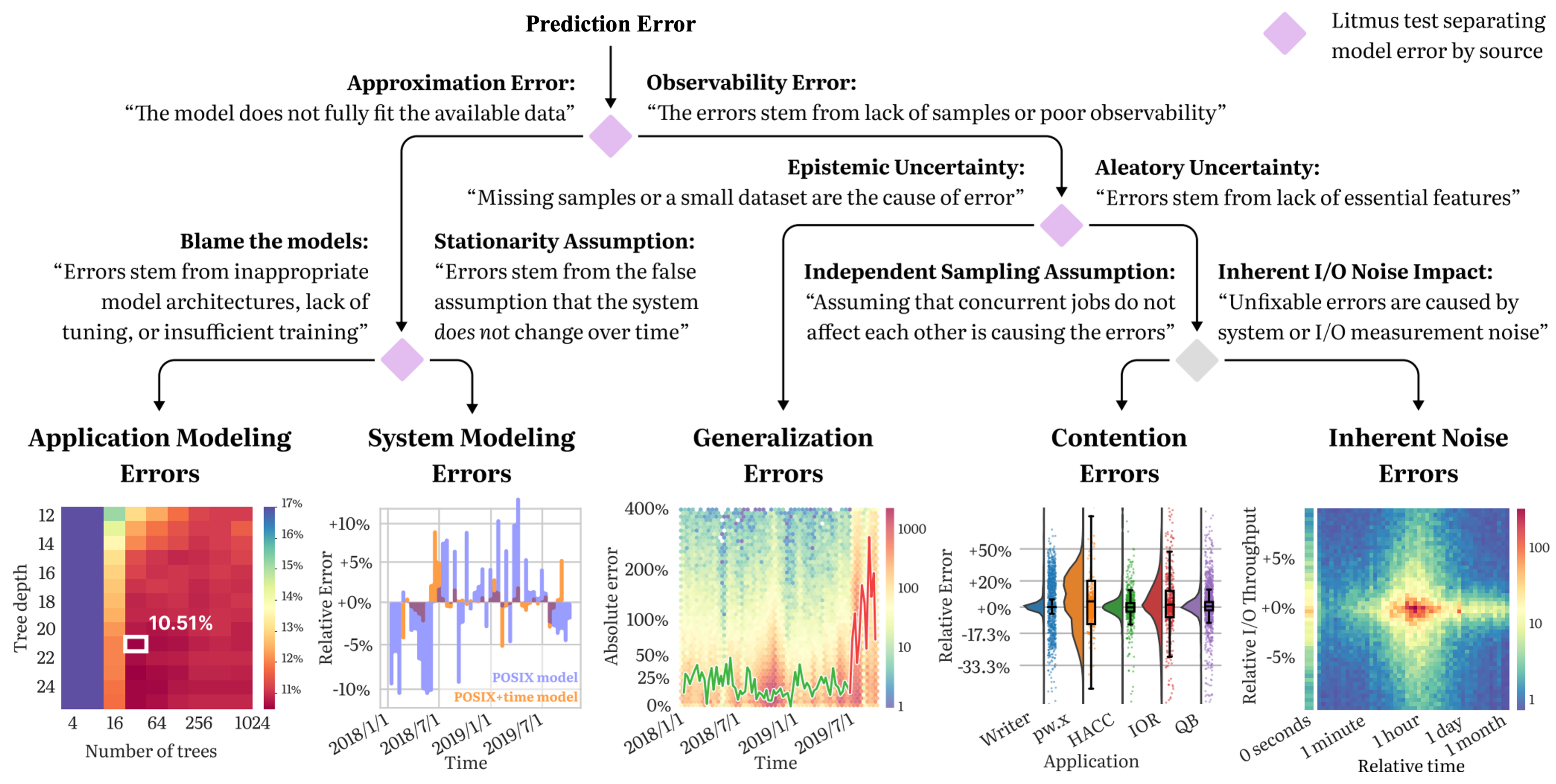
The task of modeling a system’s performance is to predict the behavior of the system when executing a job from some application on some data. There are several reasons why machine learning-based system models underperform when deployed -poor modeling choices, concept drift in the data, and weak generalization, among others. The goal of our study is to help machine learning (ML)-driven I/O modeling techniques make the transition from theory to practice. We introduce a taxonomy consisting of five categories of system modeling errors: (1) poor application modeling, (2) deficint system modeling, (2) inadequate dataset coverage, (3) contention, and (4) noise.
Application modeling errors: ML models can have varying expressivity and may not always have the correct structure or enough parameters to fit the available data. Models whose structure or training prevents them from learning the shape of the data-generating process are said to suffer from approximation errors, which are further divided into application and system modeling errors.
System modeling errors: system behavior changes over time due to transient or long-term changes such as filesystem metadata issues, failing components, new provisions, etc. A model that is only aware of application behavior, but not of system state implicitly assumes that the process is stationary.
Generalization errors: ML models generally perform well on data drawn from the same distribution from which their training set was collected. When exposed to samples highly dissimilar from their training set, the same models tend to make mispredictions. These samples are called ‘outof-distribution’ (OoD) because they come from new, shifted, distributions, or the training set does not have full coverage of the sample space.
Contention errors: a diverse and variable number of applications compete for compute, networking, and I/O bandwidth on systems and interact with each other through these shared resources.
Inherent noise errors: while hard to measure, resource sharing errors can potentially be removed through greater insight into the system and workloads. What fundamentally cannot be removed are inherent noise errors: errors due to random behavior by the system (e.g., dropped packets, randomness introduced through scheduling, etc.). Inherent noise is problematic both because ML models are bound to make errors on samples affected by noise and because noisy samples may impede model training.
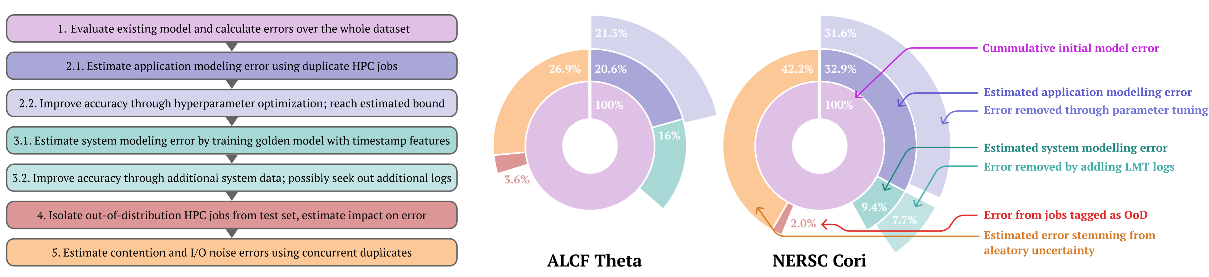
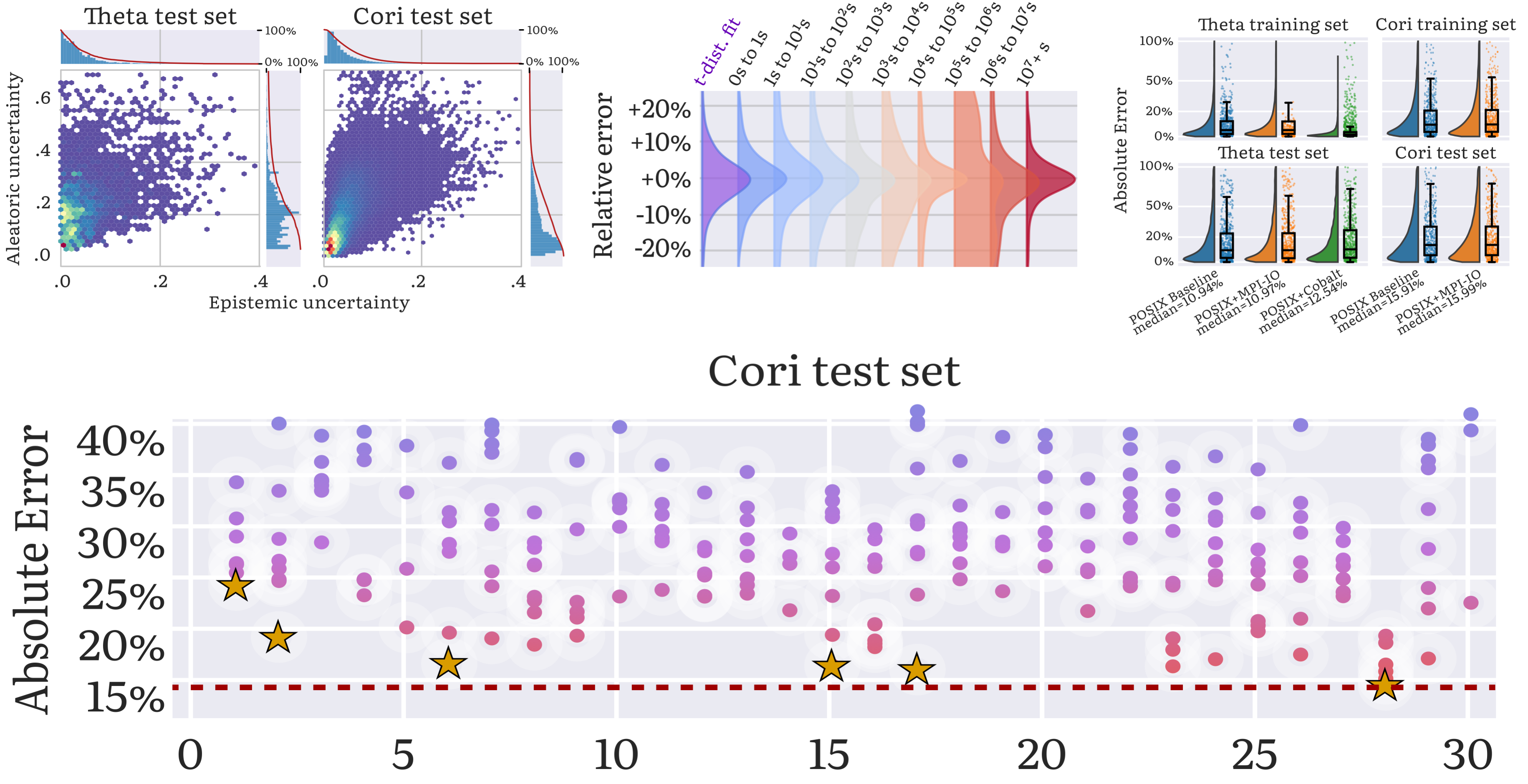
Applying the taxonomy to performance modeling and prediction on the ALCF Theta and NERSC Cori systems. Here the error estimations are broken down into different classes of error. The focus in this study is not on the cumulative error value of the two systems; instead, it is on attributing the baseline model error into the five classes of errors in the taxonomy (middle circle segments of the pie chart), and how much improved application and system modeling can help reduce the cumulative error (outer segments of the pie chart). The inner blue section of the two pie charts represents the estimated application modeling error, as arrived at in Step 2.1. The outer blue section represents how much of the error can be fixed through hyperparameter exploration, as explored in Step 2.2. The inner green section represents the estimated system modeling error, derived in Step 3.1.